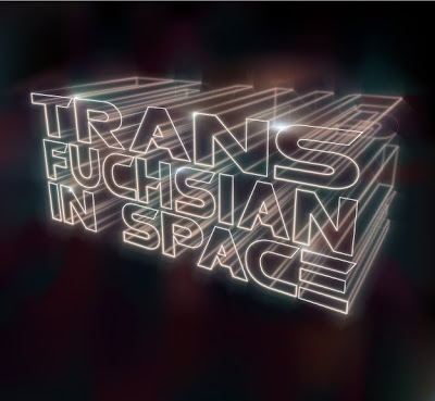
Today Transfuchsian brings you another tutorial that shows how Illustrator can perform design tasks generally reserved for Photoshop or other raster programs. Like my previous lighting effect tutorial, Photoshop is going to be easier to use for this effect, but it doesn't mean you can't get the same results in a pure vector format. So, today I bring you a lighted text effect tutorial in a new segment I like to call "Anything Photoshop can do, I can do...also".
In this one I will first show you how to create some 3D text, which we will then apply some art brushes to so that we get a neat, futuristic spacey effect. Before you begin, you may want to stop by my previous post and download a set of glowing brushes.
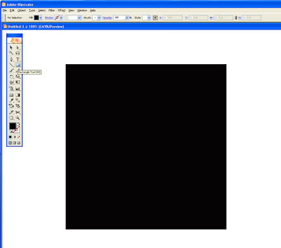
Step 1: Create a new document and draw a plain black square.
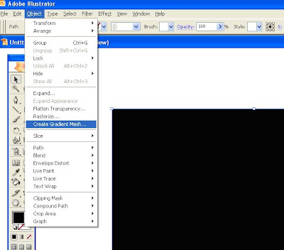
Step 2: Select your object and make a gradient mesh out of it (Object > Create Gradient Mesh). Put in 1 for rows and columns with 'Flat' as the appearance. We'll save adding in the mesh points until later when we have our test in place.
Step 3: Draw a plain black shape over top of this one and set the mode to Color Burn at 40%.
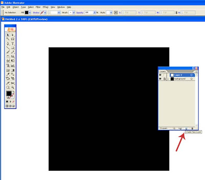
Step 4: Go ahead and lock this layer and create a new one on top of it by clicking the new layer icon.
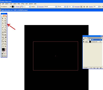
Step 5: Now we are going to make our text. On the new layer you just created, select the text tool (T) and click anywhere on your artboard to begin typing. Type in whatever you want. Note that for each line it will be easier to create a separate text object. Once you have your text, line it up however you want. I chose to make mine an overall box shape.
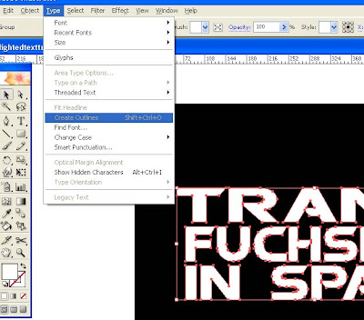
Step 6: Convert your text to out lines by going to Type > Create Outlines (or Shift + Ctrl + O).
Step 7: Group all of the text together by selecting it all, then go to Object > Group (or Ctrl + G).
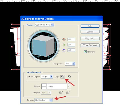
Step 8: Now we are going to make it 3D. With the text group selected go to Effect > 3D > Extrude & Bevel. You can orient your text whichever way you want. These are the settings that I used. Play around with the settings yourself until you have reached your desired effect. Make sure that you click on the Cap ON button and no shading.
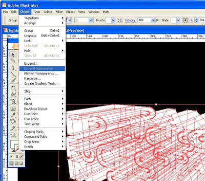
Step 9: Go ahead and expand the appearance by going to Object > Expand Appearance.
Step 10: Flip your fill and stroke so that there is no fill and a white stroke. After that, you will want to ungroup the whole thing to make it easier to work with.
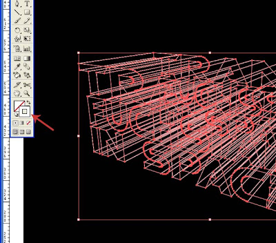
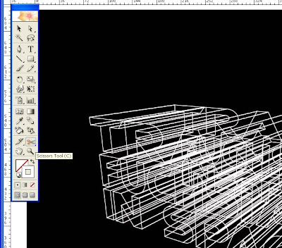
Step 11: We are now going to clear out the sections of the lines that we don't need so that it is easier to read. This is all up to your own preference. We'll go ahead and start cutting out the lines that we don't need. To do this, grab your scissor tool (C) and start cutting away. The best way to look at it is that you are cutting out the extensions of the bottom and right most lines so that you can't see them through the top and left letters.
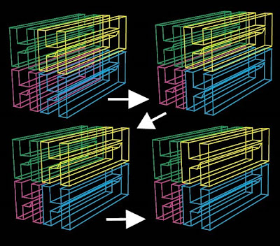
Here is an example of how to look at it. I've made each letter a different color, so that you can see easier. The yellow and blue H is closer to us and if the "outer walls" of the letter were solid, you wouldn't see any of the green or red H inside of them. You also wouldn't see any of the red inside the blue or green inside the yellow. So, what you'll want to do is cut the lines where you can see through it.
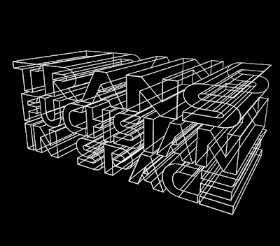
Step 12: Continue to cut up the lines until you have cleared all of the back lines out. As you can see above, it is still a little messy, but that doesn't matter once we apply the fancy strokes.
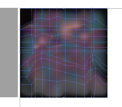
Step 13: Now we are going to set up our background. Remember your background with the gradient mesh? Unlock that layer and lock the text layer. Go ahead and move the top plain black square to the side so that we can alter the gradient mesh. Choose the gradient mesh tool (U) and begin making your mesh points. This process will be up to your preference, but I suggest making the most points in and around the text. The colors in your mesh and where they are placed are going to determine the colors of the strokes in the upcoming steps.
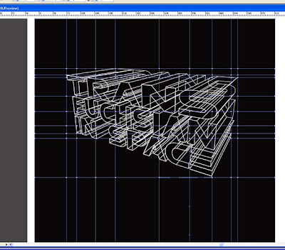
Step 14: The mesh doesn't need to be fancy, so we'll just drag the points and stagger them a bit inside and around the text. Once you have them placed, go ahead and start adding some color to them. You can use whatever colors you like, I used the same colors on the mesh as I did in my previous lighting effect tutorial. Once you are done, go ahead and place the black square back on top of the mesh and lock the layer again.
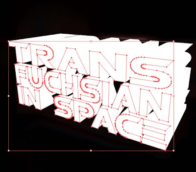
Step 15: Unlock the text layer and locate the cap (front) of the letter. The easiest way is to select all of it and flip the fill/stroke so that everything is filled white. Select only the solid fronts of the letters and group them together to make it easier to work with.
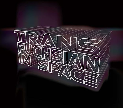
Step 16: Select everything again and switch it back to a white stroke with no fill. Keep the front letters at 100% opacity and white with a 1pt stroke. Select the rest of the lines and lower the opacity to about 50% and set the stroke to 0.25.
Tip: If you have all the other layers locked. You can have your front letter groups selected, then go to Select > Inverse and it will deselect your front letters and select everything else for you.
Step 17: Select all of the text again and group it all together (ctrl + G). Make a copy (Ctrl + C) and paste it in front (Ctrl + F). Open up your Transfuchsian light brush set and select one of the rectangle brushes in whichever color you want (I chose the light blue rectangle1). Then set the blending mode to lighten and the opacity at around 40%.
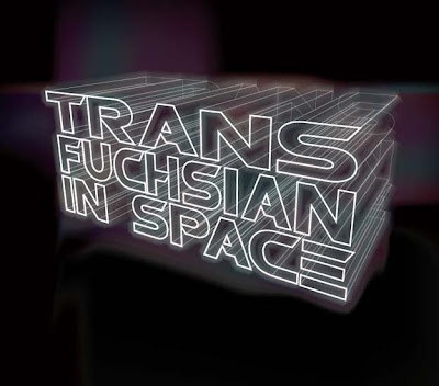
Step 18: Make another copy and paste in front. This time change the brush to a circular brush (I used round5). Set the stroke to 2 and blending mode to screen at 25%.
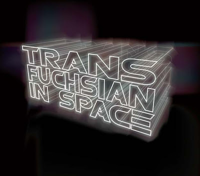
Step 19: Make yet another copy and paste in front. This brush will be an oval brush (I used the red oval3) set the mode to lighten at 75%.
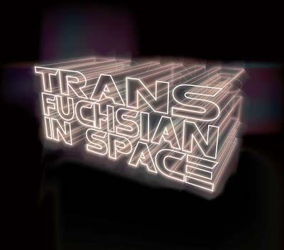
Step 20: Alright, one more copy to paste in front. This will be another round brush of your choice (I did round1). Change the stroke to 5. Mode to lighten at 20%.
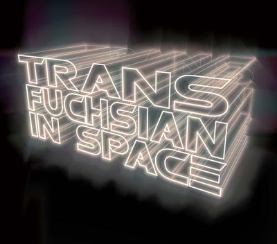
Step 21 (optional): Go back to your original gradient mesh. Select a few areas that you would like highlighted and change the color of those points to pure white. This will give you an added shining effect. I also went back and darkened up the mesh points a little so that it wasn't so bright.

Well there you have it. You can stop along any point of adding more strokes or you could add even more, it is all up to your own preference. There are many different results that you can achieve with this technique and I suggest playing around with the different brushes and the gradient mesh. I hope everybody enjoyed this tutorial.

Tidak ada komentar:
Posting Komentar